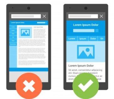
Mobile-Friendly Sites
Unfortunately, many mobile sites push full-page ads for apps, which interfere with mobile browsing so that you can’t see the content displayed. When a user taps on a search result on a mobile device, he or she sees a page that hides the content. The site prompts the user to install an app. It’s frustrating for users because they are expecting to see the content on mobile-friendly sites, not the unwanted ads.
Now, Google has decided to fight back this strategy. It will target interference when users browse the web on mobile devices. If a mobile website pushes intrusive ads for apps, prompting to install an app, also known as interstitials, it will no longer be considered mobile-friendly. Google will now use its search algorithm to penalize websites that use interstitials. These web sites will be excluded from mobile-friendly sites. The ranking of sites that fail to meet the standards outlined in Google Mobile-Friendly Test page will be lowered.
Google gives app makers, and all the web sites that use interstitials within the browser, until November 1, 2015 to prepare for the changes. They must adopt much less disruptive app-install banner ads. The new policy doesn’t affect interstitials within apps themselves. In July, Google released a study of its own use of interstitials to promote Google+. The results showed than interstitials were extremely effective, with 9% of visits to Google’s interstitial page resulting in the Get App button being pressed. The experience showed though that about 70% of visitors decided to abandon the page, and avoided Google’s mobile site. They never continued to the app store.
Also note that Search Engine Optimization (SEO) is extremely important. It helps to achieve a good ranking in search engines. Now that mobile devices have become part of our life, there are certain mobile-specific SEO practices. If you want to learn more about it, a good place to start is with Google’s own Mobile SEO guidelines, published on Google’s developer site. For example, to indicate that your site is responsive and the webpage adapts and scales depending on the device screen dimensions, you should use the viewport <meta name=”viewport” content=”width=device-width, initial-scale=1.0″>.
See also:
- Apple Encyclopedia: all information about company, products, electronic devices, operating systems and apps from iGotOffer experts.
- Best place to sell used Apple device online. Free shipping. Top cash guaranteed.


Facebook
Twitter
RSS