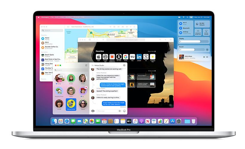
macOS 11 Big Sur: what’s new in the latest macOS’ version
Yes, it finally happened (after 19 years, no less): the new version of Apple macOS is now officially out and available for a checkout on any compatible Mac. The ambitiously named macOS 11 Big Sur can be used on MacBooks, iMacs, and both Mini and Pro versions of Apple computers.
And, judging by the amount of new things to play with this new iteration offers, the company wasn’t just twiddling their thumbs for all these 19 years.
Because the changes the Big Sur brings are not just superficial. Although, we must admit, its newfangled look is overall nice in and of itself. The more transparent, more easily readable menu bar at the upper side of the screen, with more space between the items is certainly an improvement. So is the floating dock (also with increased transparency). And the more vividly-colored, more lively-looking windows, which now match the screen contours more precisely don’t hurt the picture either. Though, for the sake of fairness, what does hurt it, is the design of new icons in this Apple system: they are heavily-shadowed and don’t blend in very well – quite the opposite, in our view. The icons of Messages, Mail, QuickTime, FaceTime and Preview are the best – or, rather, the worst – instances. Against the regular and familiar flatness of the rest of the icons, those look almost ridiculous. On the other hand, this fault is minor – and, more to the point, correctable.

Upcoming MacBook Pros could come with macOS 11 already installed.
But we digress. Let’s turn to the more substantial stuff, starting from the newly-overhauled Safari browser. Which, from what we can see, has been thoroughly improved. And if in some cases – like, for example, handling of tabs – it meant following the example of others, then, apparently so be it. By changing the way their Safari tabs operate more to the style of Chrome and Firefox (for starters, these tabs no longer close automatically) Apple showed that the quality and ease of operation remain their primary concern. They still can admit that others sometimes do something better and incorporate these betterments into their own offerings. Another welcome change is previews: now placing the cursor on a tab of the browser gives you a look of what the site contains. It helps any search a lot. Other convenience-improving features include automatic translation option, start page customization and expanded array of extensions now supported. Plus, security hasn’t been forgotten, either, what with privacy reports for the sites, now built into the browser.
Another quite important and noticeable alteration, perhaps, one of the biggest, in terms of day-to-day use of the system, is that now the Big Sur includes Control Center. Yes, we mean just the very thing that makes configuring iPhone, iPad and other smaller Apple gadgets so easily and conveniently configurable. Now it will be available on your computers too, giving you a quick way to adjust your wireless connection (from the Bluetooth to Wi-Fi), peripheral lighting, contrast, brightness, Airdrop and various screen / background modes in any way you like. And don’t you worry: the Widgets in this Control Center are not like those in older Macs’ Dashboard. These new ones work almost exactly like their counterparts on iOS / iPadOS, though, admittedly, for now they are limited only to existing, built-in apps (such as Reminders, Weather, World Clock, Podcasts and so on). But then again, it’s only a start: surely, the amount of supported apps is going to grow later on. That’s what the developers are for, after all. The only gripe we have in this respect is that the widgets in question haven’t been placed on the desktop. They are contained in the notification area. And you can’t drag you out of there, as opposed to the aforementioned gadgets. Considering how much desktop means in working on a Mac, we daresay it’s an oversight requiring some attention from the makers – but, again, not really a major one.
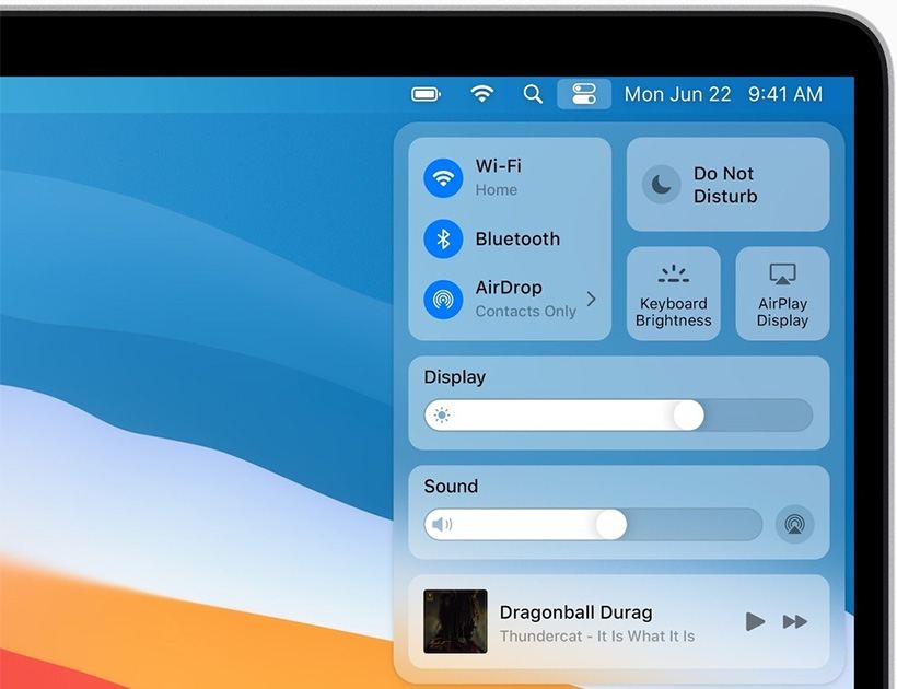
Another quite important and noticeable alteration, perhaps, one of the biggest, in terms of day-to-day use of the system, is that now the Big Sur includes Control Center.
The Messages and Maps apps have also been brought more on par with what they offer on iPhones and iPads. The former now includes the option to pin contacts and message threads to the top of a list, the improved search functionality, more group message features (such as mentions and inline responses), Memoji and a full library of GIFs. As for the Maps’ main updates (coming both in computer and iPhone / iPad versions), you will now have indoor maps of airports and various large selling spots, from shop centers to the malls, guides to many well-known attractions and areas (plus, in case of the big cities, 360-degree views of them) and improved 3D Look Around. Besides, the Message app, Control Centre and Widgets we know so well from the smaller gadgets like iPad and iPhone, will now be accessible on your MacBooks, too, bringing quicker and easier configuration of your machine with it.
For more hardware-minded ones among us, we should mention that this design also noticeably takes into account the upcoming silicon transition Apple is currently preparing for (the new boot mode is one clear sign of it), but the details like this have to be saved for the final version release.
And finally, it would be wrong of us not to give you one essential warning before you try your hand at these new riches, bells and whistles. All its improvements, additions and (sometimes drastic) interesting changes notwithstanding, don’t install the Big Sur on your main working machine just yet. It’s all well and good to check it out, but do that on your extra Mac. Once again, it’s not the final version, so it’s too early to fully rely on just yet.
Links
- macOS 11 Big Sur: release date, name and features – TechRadar
- Sell your used Mac Online – iGotOffer
- Everything About Apple’s Products – The complete guide to all Apple consumer electronic products, including technical specifications, identifiers and other valuable information.
macOS Big Sur Public Beta Overview and How to Install [Video]
Video uploaded by zollotech on August 6, 2020




Facebook
Twitter
RSS