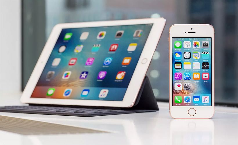
iOS 13 Dark Mode, “Find My” App, & Reminders Redesign LEAKED [Video]
Video uploaded by BRIGHT SIDE on October 11, 2020
Hidden treasures or what you might not know about your iPhone and iPad but would do well knowing
Yes, here we are again talking about those less obvious features and options available on your Apple gadgets – Iphone and iPad in this particular case – which you might have missed among the endless array on offer. But what else can we do if new sets and configurations never stop coming? The topic may not be particularly new, but you have to give us one thing at least: it is timely for sure. Because these out of sight treasures we are about to reveal to you come with two versions of the newest Apple’s platform – iOs14 and iPadOS 14., to wit. And, once you’ll learn about them, who knows, it may make parting with a considerable amount of money to get those systems for your phone or tablet ($699 and $244 respectively) just a little bit easier. So here we go.
Let’s start with, perhaps, the most interesting of those not-readily-seen upgrades and additions – namely, with a historical first for Apple as far as using apps is concerned. From now on, the Apple crowd – at least, the proud owners of iOs14 / iPadOs14 – will have a choice which browser or email software to make their primary ones. Yes, truly, Safari is no longer the compulsory choice for Apple’s clientele, which can now – shock, horror – switch to, say Google’s Chrome. And the same goes for email: believe it or not, but iOs14 users are allowed even a greater infidelity – in other words, selecting Outlook for writing, sending and receiving their mails. No wonder Apple doesn’t seem to be all that willing to draw attention to this particular change. But that’s what our eagle eye is for… OK, enough boasting, let’s get to business at hand. To assign the default status to a different browser than Safari or a different email client than Mail through your Settings (well, that is almost universal port of call, is it not?), you have to look at the end of your applications list. There is where you’ll find all your potential substitutions, from Chrome to Edge (in terms of browsers) and from Outlook to Hey (as far as email clients are concerned). Tapping on any of them will – again, only in iOS14 and iPadOS14 – bring up the Default Browser (or Email) App option. Go for it, and you’ll have your new default ready and raring to go after the restart. At least, so it is supposed to be. Old habits, as they say, die hard, and in reality – for now, at least – this action just gets reset once you restart your device. Apple calls it an unintended bug and promises a fixing update. Well, here’s hoping… At least know for now that this possibility is meant to be there.
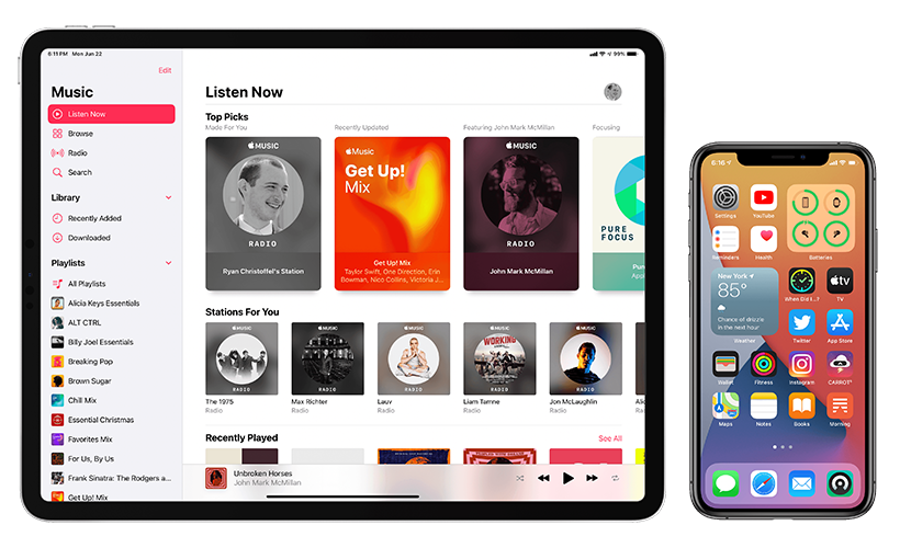
From now on, the Apple crowd – at least, the proud owners of iOs14 / iPadOs14 – will have a choice which browser or email software to make their primary ones.
Another rather useful improvement offered by the new OS is AppLibrary. We all know how tiring it is to scroll through the icons of rarely-used apps cluttering your home screen. Well, AppLibrary allows you to get a full panel (or several of them) consisting of such apps out of your sight quickly and rather painlessly. All you have to do is press and hold any free spot on your display in order to activate the edit mode. This will bring up the page indicator. Tap on it, and you’ll see checkboxes next to all the homescreen views available on your phone / iPad. Mark all the boxes affiliated with the panels you don’t wish to see (but still want to have just in case) and they will obediently hide into the deep recesses of the aforesaid AppLibrary. This way, they will remain available but won’t needlessly bother you, obscuring your more pertinent icons from view.
And, now that we’re on the subject of icons and home screens, here’s one more useful tip. As we all know, installing new applications is pretty much a never-ending process. So, after the aforesaid (much easier than before, but still somewhat time-taking) task is done, you might find your screen view unwantedly changed yet again, with this newly-installed app or widget sitting proudly among those you selected for your homescreen yourself. And here is where AppLibrary comes in handy again. Just choose the Home Screen menu in your Settings, then find the App Library Only submenu in the upper section of the screen. Once there, head for the Recently Added folder in the upper right corner of the display. There, just as it promises, you’ll see all your freshly downloaded widgets and applications… and will be able to perform the same check-and-send-away operation on them as you did on your unneeded panels.
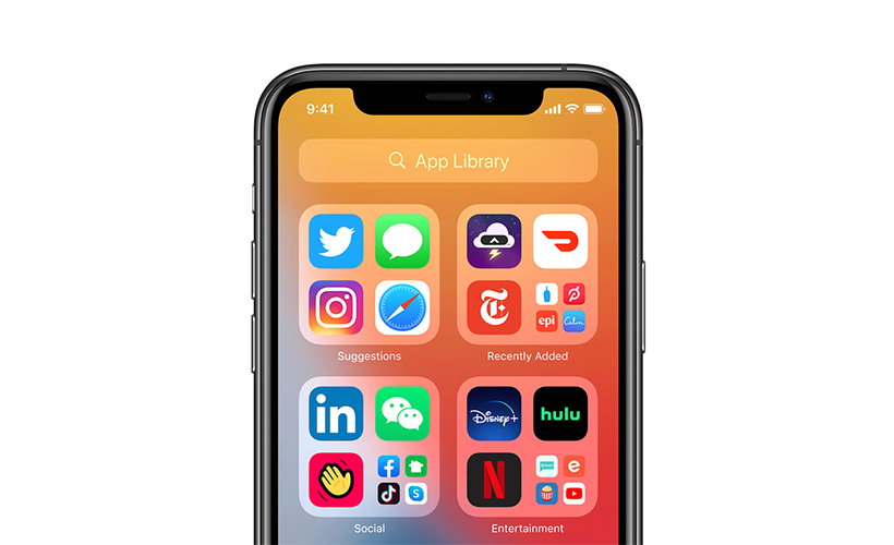
Just choose the Home Screen menu in your Settings, then find the App Library Only submenu in the upper section of the screen. Once there, head for the Recently Added folder in the upper right corner of the display.
Staying on the topic of hiding / removing-from-view, you now also can do it much more effectively with your photos and videos. In all existing platforms, Hidden Album contained in the Photos isn’t in fact quite that well hidden (no offence, Apple, but there’s no denying facts). The new OS, however, is much better at it, but to realize this fact and discover a more efficient image-camouflaging option you also have to know where to look. Because it isn’t all that apparent (to put it mildly) that in order to use this option you actually have to turn the aforementioned Hidden Album off (by opening the Photos menu in Settings and deactivating the switch). And no, it won’t erase your pictures and clips from your phone / iPad storage or from your iCloud. Whenever you switch Hidden Album back on, you’ll see it all again. But until you do so, no one, and we mean, no one, will have any chance to see what you want to conceal.
Now that we are done with hiding photos, let’s go to watching videoclips. Mind you, this particular bit of good news only relates to iPhones, because iPads already sports the option in question. We are talking about the so-called “Picture in Picture”. Yes, with the arrival of iOS14 it will be available on your iPhone as well, both for video calling (through FaceTime) and simple viewing. Just swipe up from the lower edge of the display during the viewing, and your video will go into the thumbnail mode and start floating across the screen. And even though this option doesn’t officially extend to YouTube, you can still bypass this limit if you’ll open such videos in your Safari browser and choose the full screen regime. then this swipe up magic will continue to work, and the clip won’t close even after you’ll switch to the home screen. And, before more cautious of you will ask, yes, this PiP thing IS reversible alright. You’ll find the switch-off option in Setting’s General menu, under – you guessed it – Picture in Picture.
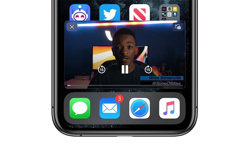
We are talking about the so-called “Picture in Picture”. Yes, with the arrival of iOS14 it will be available on your iPhone as well, both for video calling (through FaceTime) and simple viewing.
The next not quite jumping-at-you enhancement brought about by iOs14 / iPadOS14 we want to draw your attention to might not be quite as important as the rest of them, but is still very, very convenient for our money. In these times of almost exclusively online communications, all-pervasive social networks and – consequently – literally myriads of smiles and emojis we decorate and enliven our messages and posts with, the searching engine for the said emojis is virtually a godsend. Yes, we (well, most of us) can manage without it, but not having to browse among those various expressions of our various feelings and emotions really helps a lot. So, thank you, the new platform, for including a search box in the emoji keyboard. At last. The wide audiences have by now got so used to it not being there, it could easily go unnoticed. But not on our watch. And, just to help further: it’s placed at the upper edge of the keyboard.
We are also happy to inform you that, after a false start with the iOS13, the eye contact property finally got included into FaceTime with the iOs14 / iPadOS14. Once you’ll activate this feature (aptly named Eye Contact) in Setting’s FaceTime menu, you’ll be able to look wherever you want during your future video calls, and FaceTime will still make it appear to the other party as if you are looking straight into their (or, rather, camera’s) eye. At least, now we’ll feel less exposed and vulnerable than we became with this double-edged invention of video contacts.

We are also happy to inform you that, after a false start with the iOS13, the eye contact property finally got included into FaceTime with the iOs14 / iPadOS14.
And now for something a bit funny, at least, from where we stand. As if in admittance of the much-mocked fact that with all these features, options, apps and widgets, no screen size can hold them all at once, Apple has now put even the backs of their devices to the same task. No, we’re not kidding: the iOs14 / iPadOS14 platform does indeed come with the Back Tap feature, enabling you to do just what it says on the tin. To extend your iPhone’s or iPad’s operability this way, open the Accessibility menu in Settings and choose Touch. That will bring you to the Back Tap option and, consequently, to the list of what you can do with your gadget by tapping on its back (twice or thrice). And, just so you know, it includes not just some superficial actions purely for the sake of showing off, but such crucial operations as the shortcut icons’ activation or performing multiple tasks in the Control Centre. Mark the taps you prefer (and yes, you can choose as many as you want), and from then on the applications such as Siri will start when you’ll make three back taps. And screenshots can be made in the same way, too. Again, to calm the suspicious and nervous among us, don’t be afraid of accidental app launching and picture-making: it is reported that iOS14-equipped devices do a good job of telling intentional tapping from random touching.
Finally, to balance out the subject platform’s improvement exclusive only to the iPhone that we described above, let us introduce to you the iPad-specific one as well. The iPadOS14 will augment the assortment of features current iPads offer with one more, called Scribble. This will, as is rather clear from its title, give more use to the Apple Pencil. Whereas before it just allowed the tablet to accept your written text (and on certain conditions at that), with iPadOS14 you can write with it in all text fields there are, and, on top of that, your writings will appear in the typed form on screen. That will make going from, well, scribbling to typing that much smoother, quicker and easier, which, for example, is really helpful when you have to combine various writing tasks (for example, responding to mails and working on articles).
And now, considering all of the above, can you still contest the fact that sometimes even not so original topics are worth bringing up again (and again)? Or that certain not readily obvious things are really worth looking for?
Links
- 20+ Hidden Features Your iPhone Had This Whole Time – MacRumors
- How Can You Trade a Pre-owned iPhone Online – iGotOffer
- Everything About Apple’s Products – The complete guide to all Apple consumer electronic products, including technical specifications, identifiers and other valuable information.





Facebook
Twitter
RSS